For some time now, I’ve been interested in figuring out how to create a vector plot in Excel. I didn’t really have a need for it personally, but I thought it would be an interesting challenge and might be helpful to someone else. Here’s what I came up with, created completely in Excel:

Creating the Vector Data
I didn’t have any vector data handy, so I had to make some up. For this exercise our vector field will be defined by the following:

The first step was to define the grid for the vector field. I chose an evenly spaced grid with dimensions 0.3 x 0.3. I also decided, for simplicity, to place the tails of each vector, rather than the mid-point, on the grid. So, the first step then, was to create two columns for the x1 and y1 values, or the position of the tails of each vector.

Elevate Your Engineering With Excel
Advance in Excel with engineering-focused training that equips you with the skills to streamline projects and accelerate your career.
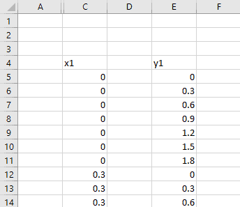
In the columns immediately next to x1 and y1, I then created the x2 and y2 columns. These points will be the head or arrow end of the vectors. The head of the vector should be located at the position x1+fx and y1+fy. But, this absolute position makes the vectors REALLY LARGE relative to the grid spacing.
Typically, in a vector plot, what we care about is the relative size of the vectors compared with one another. To address this, I added a scaling factor in the calculation for x2 and y2. A value of 0.1 worked well in this case. The formula for x2 is shown below.
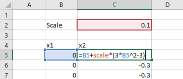
If you were trying to make a vector plot from existing data, you could add another column to multiply your data by a scaling factor.
Now that we have four columns of values that fully define the vectors, we can create our vector plot in Excel.
Creating a Vector Plot in Excel
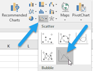
The vector plot is made from the scatter chart type in Excel. So, I started by inserting a blank one on the worksheet.
Each vector will be represented by a data series. To start populating the chart, I right-clicked on it and chose “Select Data” from the menu. Next, I added the new series by selecting the first row of x1 and x2 values as the “Series X-Values” and the first row of y1 and y2 values as the “Series Y-values”.
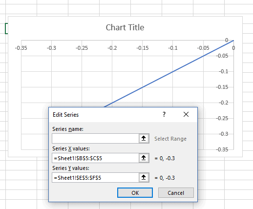
Next, I added an arrow head to the vector by changing its formatting. I selected the data series first, then navigated to the Chart Tools> Format tab to add the arrow head.
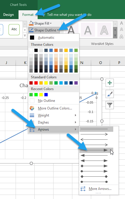
Now I have something that looks like a vector on my chart. I also made the plot area square so that it doesn’t skew the vectors.
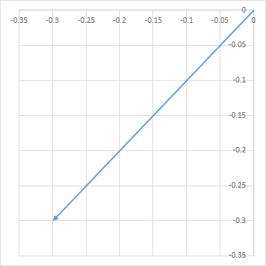
All that’s left is to repeat this process for each vector. Easy, right?
I have better things to do than click buttons all day to add all the individual vectors to this chart. 🙂 I’m guessing you do too! So, let’s do it a little more smartly, shall we?
Using VBA to Add Data Series’ to an Excel Scatter Chart
Instead of adding each vector manually by clicking buttons in Excel, I created a subroutine to add each series. The VBA for the subroutine is below:
Sub add_vector()

Dim xvalues As String

Dim yvalues As String

ActiveSheet.ChartObjects("Chart 7").Activate

ActiveChart.PlotArea.Select

For i = 1 To 49

xvalues = "=Sheet1!$C$" & i + 4 & ":$D$" & i + 4

yvalues = "=Sheet1!$F$" & i + 4 & ":$G$" & i + 4

ActiveChart.SeriesCollection.NewSeries

ActiveChart.FullSeriesCollection(i).xvalues = xvalues

ActiveChart.FullSeriesCollection(i).Values = yvalues

ActiveChart.FullSeriesCollection(i).Select

With Selection.Format.Line

.EndArrowheadLength = msoArrowheadLengthMedium

.EndArrowheadWidth = msoArrowheadWidthMedium

.EndArrowheadStyle = msoArrowheadTriangle

.ForeColor.RGB = RGB(0, 0, 0)

End With

Next i

End Sub
Here’s what the subroutine does:
- Activates the chart (mine was called “Chart7”) and selects the plot area
- Starts a “For” loop to loop through each of the 49 rows of values.
- Define the xvalues as the cells in the current row and columns C and D as a string that can be fed into the scatter chart
- Define the yvalues as the cells in the current row and columns E and F
- Add a new series to the chart using the x-values and the y-values
- Then format the newly-added series
- Add the arrow head
- Make the color black
- Finally, move on to the next row, until all 49 are done
The result, after removing the axis labels and adjusting the limits, is this:
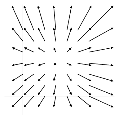
Looks like a vector plot, doesn’t it? 😉
Each row of x- and y-values from the table is represented as a vector, with the tail of each vector aligned to the pre-defined grid. To make the vector chart so that the midpoint of the vector was on the grid, I would have needed to define a third point for each vector.
What’s next?
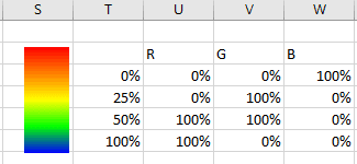
I want to enhance the vector plot by adding a color scale so that the color of the vectors changes with their magnitude. Basically, the smallest vectors will be blue and the largest ones red. This will involve some linear interpolation with RGB values, like I’ve shown below:
Notes:
This method will only work for vector plots where the number of vectors is less than 255 because of Excel’s chart series limitation. Only 255 data series are allowed per chart.
