
Often, engineers need to display two or more series of data on the same chart. In this section, we’ll add a second plot to the chart in Worksheet 02b.
The first method is via the Select Data Source window, similar to the last section. Right-click the chart and choose Select Data. Click Add above the bottom-left window to add a new series. In the Edit Series window, click in the first box, then click the header for column D. This time, Excel won’t know the X values automatically. Click inside the box below Series X values, then select the X data (either click and drag or click the first cell and press Ctrl-Shift-Down). Repeat for the Y values and choose OK.
In the Select Data Source window, we can also give a name to the first series. Select it, choose Edit, then choose the header for column C. Click OK and both data series will be shown on the chart.
There’s another method to add series that may be easier when you’re dealing with large amounts of data. Click on the data that’s plotted on the chart. Type Ctrl-C to copy it, and Ctrl-V to paste it. This will paste a second series that has the same input data (so it lies directly on top of the first one).
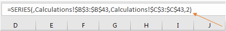
To see what’s happening, we can click on the data series and look at the formula bar:

Elevate Your Engineering With Excel
Advance in Excel with engineering-focused training that equips you with the skills to streamline projects and accelerate your career.
We have the same formula as before, where cells B3-B43 are the X data, and C3-C43 are the Y data. However, the last argument is a 2. If you press the Down Arrow key, that argument changes to a 1 – this is the original curve. There are now two data series currently on the chart (you can verify this by checking the Select Data Source window).
We’re now able to edit the data for one of the data series, similar to in the previous section. Click on the curve, then click and drag the selected Y data (remember to hover over the blue border to get the pointer with four arrows). Do the same for the title’s red box so the new series is titled correctly:
To change the colors of the series so that each one has its own unique color, click the paintbrush next to the upper right of the chart, then Color, and choose a different palette.
Currently, both data series are sharing a common y-axis, and the amplitude of the sine wave is small relative to the range of the first curve. You can add a secondary axis so that the sine wave covers more of the chart by right-clicking on it, selecting Format Data Series, and choosing Secondary Axis from the task pane.
This will add an additional axis on the right side of the chart. It also scales the sine wave to cover most of the chart area. However, Excel always leaves extra empty space on both sides of an axis by default, so you can modify the axis as we did in Section 1 of this chapter. With the task pane still open, click on the new axis. Switch to Axis Options with the bar chart icon: ![]()
For these data, a range of ±0.2 works well. Set the minimum bound to -0.2 and the maximum to 0.2. Scroll down in the task pane to Number and reduces the decimal places to 2. Close the task pane.
To finish formatting this chart, we’ll add appropriate labels. To add a title to the new axis, click in the chart area and select the green plus sign. Select the arrow next to Axis Titles (visible when you hover over it), and click the checkbox next to Secondary Vertical:
Double-click the new axis title to rename it.
We can also change the color scheme of our graph to make it clear which dataset belongs to each axis. Select the axis and change the color to match the data with the Font Color tool:
You can change the axis title in the same way.
As another way of identifying which data goes with which axis, we can add a legend to the bottom of the chart. Click the green plus sign, then the arrow next to Legend, and select Bottom:
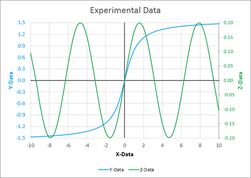
These modifications give us the chart below. The chart is well-labeled and the color-coding makes it easy to identify which data go with each axis.
Finally, we can quickly add data to a chart using VBA. I’ve demonstrated how to do that in my 2-part series on creating a vector plot in Excel. You can see the final installment, where I created a colored vector plot using a scatter chart here.