
Importing text data into Excel for analysis is pretty straightforward, but what if you want to use data from a chart in a book or some other reference? There’s a free tool that will let you convert graphical charts into text data: Engauge Digitizer.
Go to https://markummitchell.github.io/engauge-digitizer/, and click “Latest Releases.” Choose the appropriate installer for your operating system.
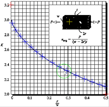
The file stress_concentration_hole.jpg is an image of a stress concentration curve for an axially loaded rectangular bar with a hole through the middle. The stress concentration factor is given as a function of the radius of the hole divided by the width of the bar.
To be able to use the data in a spreadsheet, you’ll need to convert the chart to pairs of XY data using Engauge Digitizer.
Once you have the software installed and open, select File > Import, then open stress_concentration_hole.jpg. In the wizard that opens, click Next twice, then Finish.
Any image that’s color or grayscale will look terrible at first, but we can correct it by going to Settings > Color Filter. Adjust the filters by clicking and dragging the green arrows until a recognizable curve appears, then click OK:

Elevate Your Engineering With Excel
Advance in Excel with engineering-focused training that equips you with the skills to streamline projects and accelerate your career.
Next, you’ll need to tell the software where the axis points are. Select the button with the three red crosses (![]() ). Place the crosshair over the intersection of the x- and y-axes. Left-click, then enter the coordinates for this axis point (x=0, y=2).
). Place the crosshair over the intersection of the x- and y-axes. Left-click, then enter the coordinates for this axis point (x=0, y=2).
Repeat for the highest marked point on the y-axis (x=0, y=3.2) and on the x-axis (x=0.5, y=2).
Next, add points by selecting the Point Match tool (![]() ) and clicking various points on the curve. These are the points that will be exported later as XY coordinates.
) and clicking various points on the curve. These are the points that will be exported later as XY coordinates.
With enough data points selected, the coordinates can be exported to a .csv (comma separated values) file by choosing File and Export. Accept the default name and click Save.
Now Excel can import the data into a worksheet using a text data import. Go to Data > From Text, then double-click on the .csv file that was just created. Make sure the delimited option is selected and click Next. Select the comma delimited option, then click Finish. Choose a location for the data.
To verify that the data was imported properly, select the X and Y column, then create a scatter chart. You can use the Quick Access Toolbar button or go to the Insert tab and find the Scatter Chart button.
Right-click the y-axis and choose Format Axis. Change the minimum and maximum to match the chart in the image (minimum = 2.0, maximum = 3.2). Now the Excel chart is the same as the original:
These data can be used in calculations going forward by using lookups or linear interpolation.