
Formatting charts can take a lot of time, but you can save time by reusing your formatting. We’ll look at how to do this using the charts from the beginning of this chapter. The example shown is an XY chart, but you could apply the same techniques to a bar, column or line chart too.
In Worksheet 02e, you’ll see the chart from Section 2 of this chapter. In that section, we swapped out the column of Y-data for the Z-data. What if we want to create two charts with identical formatting for each of these data sets?
You can simply copy the chart – click anywhere on the chart and type Ctrl-C. Click anywhere else in the spreadsheet and type Ctrl-V to paste.
To change the data on this new chart, we can simply click on the data series in the chart then hover over the border of the Y-Data column. When your cursor becomes a pointer with four arrows, click and drag the range box over to the Z-Data column.
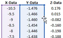
The titles and all the formatting will be retained, so you can update the title on the y-axis. We’ve also retained formatting such as the maximum and minimum values on the axes, the major units on the y-axis, and the dark gridlines.

Elevate Your Engineering With Excel
Advance in Excel with engineering-focused training that equips you with the skills to streamline projects and accelerate your career.
This is a quick way to copy formatting from an existing chart to a new one. The disadvantage to this method is that it’s difficult to use across multiple workbooks. It only works well for copying chart formatting in the same workbook.
There’s another method that will work across workbooks. Right-click on the original chart and choose Save as Template. This will open up a window for you to save a Chart Template File. Now, that template will be accessible both inside this workbook and in others.
To put this template to use, we’ll create a chart from scratch. In this case, we’ll be plotting non-adjacent data, so hold Ctrl when you select the second column. (If you use Ctrl-Shift-Down to select data, you’ll need to release all three buttons before clicking the second column. Hold Ctrl and click the second column header.) Create a scatter chart with the Quick Access Toolbar button.
The chart will be created with default formatting. To use the formatting from the template, select Change Chart Type in the Design tab:
Select Templates at the left, then choose the template we just created titled Chart1.
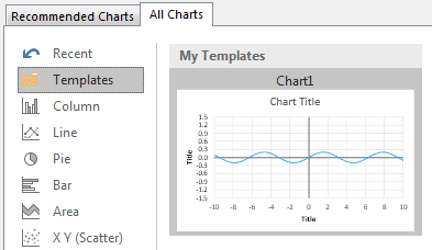
Many aspects of the formatting have been preserved – the minimum and maximum axis values, the dark axes, and the major units we specified on the y-axis. However, the titles were not preserved. Instead, we have some default titles based on the data we selected.
This template will be available any time you open Excel. You can create templates for charts that you use often to save you some of the formatting steps.