
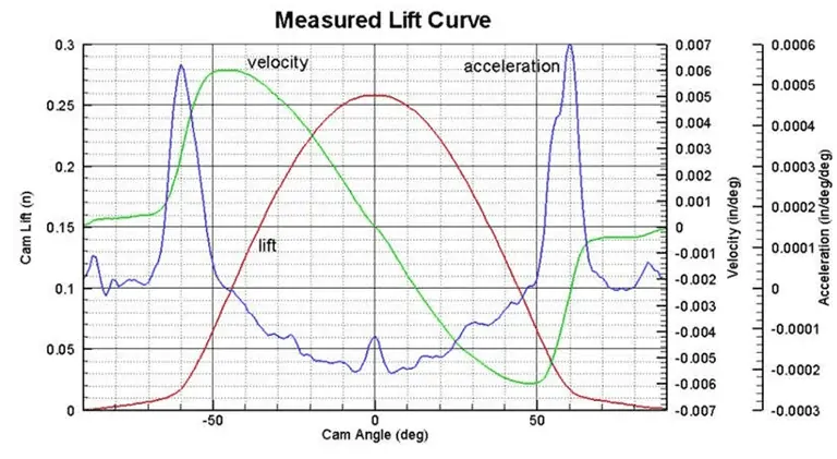
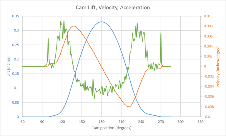
Ever wanted to know how to create a 3 axis graph in Excel? The other day I got a question from Todd, an EngineerExcel.com subscriber. He uses Excel to create charts of cam position, velocity, and acceleration. The industry-standard way of graphing this data is to include all three curves on the same chart, like in the image below, and he wanted create one like it in Excel. Multiple y-axis charts in Excel are straightforward if you only need to plot 2 y-axes but 3 y-axes take some more work and a little creativity. I’ll show all the steps necessary to create an Excel graph with 3 variables below.
Create a 3 Axis Graph in Excel
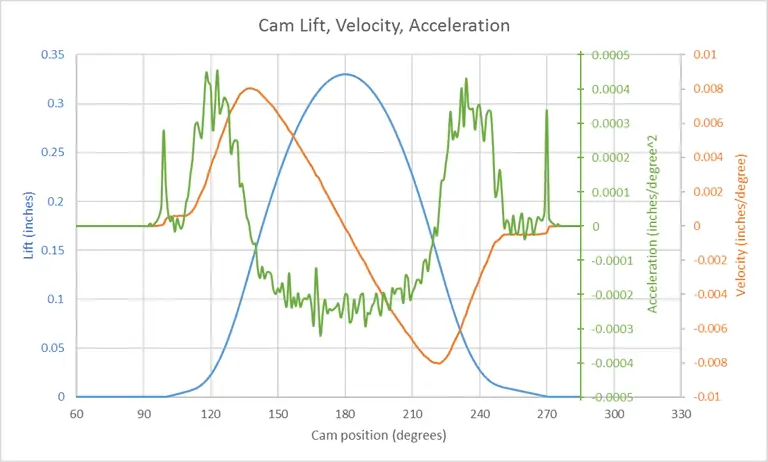
The challenge is that all three curves have very different scales, with acceleration being the smallest. This makes it hard to view the acceleration curve on the chart without a unique axis. So he wanted to know if there was a way to create a 3 axis graph in Excel. Unfortunately, there isn’t native functionality to create one, but we can fake an Excel graph with 3 variables by creating another data series with a constant x-value, like I’ve done in the image below.

Elevate Your Engineering With Excel
Advance in Excel with engineering-focused training that equips you with the skills to streamline projects and accelerate your career.
It’s not a perfect solution, but to my knowledge, it’s the best we can do in Excel with the currently available toolset.
Scale the Data for an Excel Graph with 3 Variables
Excel allows us to add a second axis to a scatter chart and we’ll use this for velocity and acceleration.
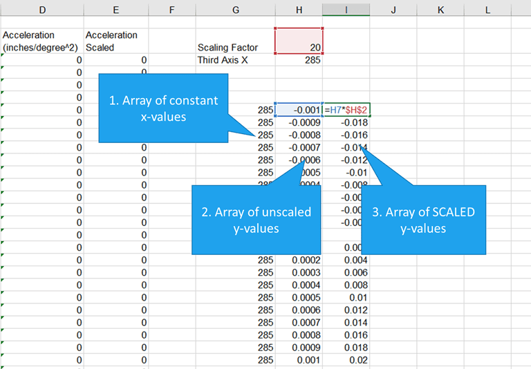
However, we’ll want to scale the acceleration data so that it fills the chart area. To do this, I entered an appropriate scaling factor in the spreadsheet and created a new column of scaled acceleration data by multiplying the original acceleration data by the scaling factor.
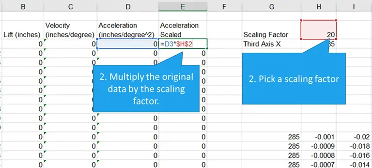
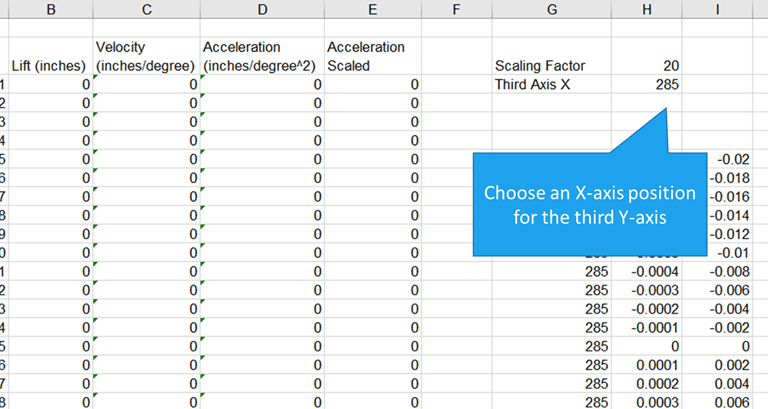
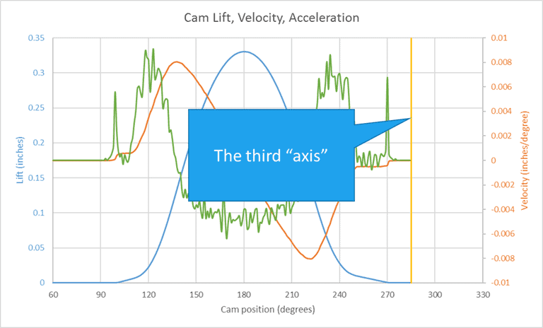
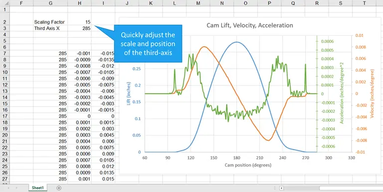
Decide on a Position for the Third Y-Axis
The third y-axis (which will really be a data series) will be on the chart area, so it has to cross the x-axis at some point. I picked a value of 285 degrees, since the position, and therefore the velocity and acceleration, are zero beyond this point. Of course, we can always change this later.
Select the Data for the 3 Axis Graph in Excel
Next, I created a chart by selecting the angle, position, velocity, and scaled acceleration data. I put the velocity and scaled acceleration data on the secondary axis of the chart.
The scaled acceleration data could have been on the primary axis. In that case, I would have had to use a different scaling factor.
I also added some color to the axes and axis labels for clarity.
Create Three Arrays for the 3-Axis Chart
For an Excel graph with 3 variables, the third variable must be scaled to fill the chart. After inserting the chart, I created three arrays:
- An array of the x-axis values for the third “y-axis” of the graph
- An array of unscaled values that are roughly on the same order of magnitude but also fully encompass the original acceleration data. For example, the range of acceleration data was from ~-0.0005 to ~0.0005. So I chose -0.001 and 0.001 as limits
- An array of scaled (calculated) values, using the scaling factor from above.
These arrays were used to create the third y-axis in the next step.
How to Add a Third Axis in Excel: Create an “axis” from the fourth data series
Next, I added a fourth data series to create the 3 axis graph in Excel.
The x-values for the series were the array of constants and the y-values were the unscaled values.
I also modified the line style to match the weight of the other gridlines, added markers (the kind that look like plus signs), and changed the color of the line and marker to match the data series (green).
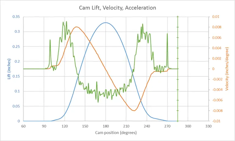
Add Data Labels To a Multiple Y-Axis Excel Chart
Axis labels were created by right-clicking on the series and selecting “Add Data Labels”. By default, Excel adds the y-values of the data series. In this case, these were the scaled values, which wouldn’t have been accurate labels for the axis (they would have corresponded directly to the secondary axis).
However, in Excel 2013 and later, you can choose a range for the data labels. For this chart, that is the array of unscaled values that was created previously.
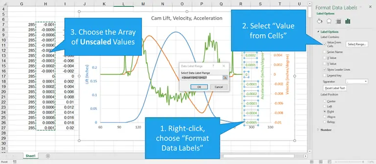
So I right-clicked on the data labels, then chose “Format Data Labels”.
Then, in the Format Data Labels Task Pane, I selected the box next to “Values from Cells”.
This opens a small dialog box that allowed me to select a range. I chose the array of unscaled values and clicked OK.
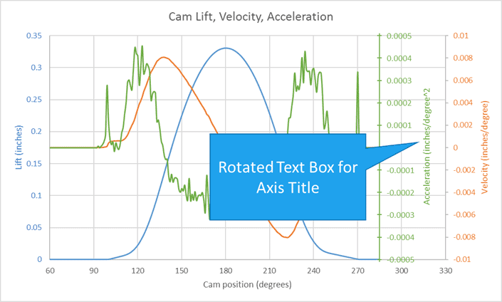
Add a Text Box for the Third Axis Title
Finally, I added a text box next to the axis and typed in the title.
Updating the Chart
If the data is ever updated, it’s simple to change the scaling factor and/or x-axis position of the third y-axis. Just modify the values in the worksheet, and the 3 axis graph will update automatically in Excel.
How do you make a 4-axis graph in Excel?
The process demonstrated above to create a third axis could be duplicated to create 4 or more axes in an Excel graph. In summary, the process is as follows:
- Scale the data
- Set the position of the fourth y-axis
- Select the data
- Create the arrays
- Create the fourth axis using a data series
- Add data labels for the 4th axis
- Use a text box to give the fourth axis a title