
As an engineer, you’re probably using Excel almost every day. It doesn’t matter what industry you are in; Excel is used EVERYWHERE in engineering.
Excel is a huge program with a lot of great potential, but how do you know if you’re using it to its fullest capabilities? These 9 tips will help you start to get the most out of Excel for engineering.
1. Convert Units without External Tools
If you’re like me, you probably work with different units daily. It’s one of the great annoyances of the engineering life. But, it’s become much less annoying thanks to a function in Excel that can do the grunt work for you: CONVERT. It’s syntax is:
CONVERT(number, from_unit, to_unit)
Where number is the value that you want to convert, from_unit is the unit of number, and to_unit is the resulting unit you want to obtain.

Elevate Your Engineering With Excel
Advance in Excel with engineering-focused training that equips you with the skills to streamline projects and accelerate your career.
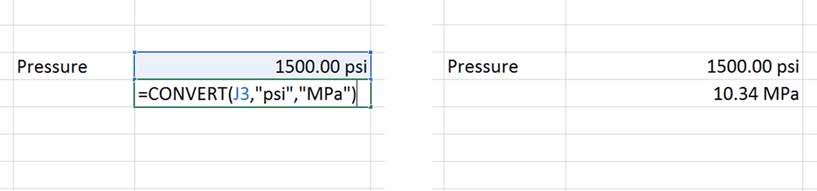
Now, you’ll no longer have to go to outside tools to find conversion factors, or hard code the factors into your spreadsheets to cause confusion later. Just let the CONVERT function do the work for you.
You’ll find a complete list of base units that Excel recognizes as “from_unit” and “to_unit” here (warning: not all units are available in earlier versions of Excel), but you can also use the function multiple times to convert more complex units that are common in engineering.
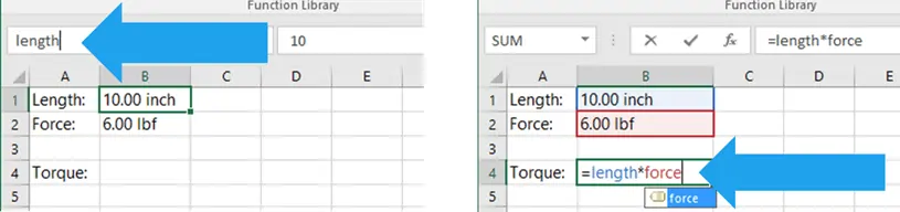
2. Use Named Ranges to Make Formulas Easier to Understand
Engineering is challenging enough, without trying to figure out what an equation like (G15+$C$4)/F9-H2 means. To eliminate the pain associated with Excel cell references, use Named Ranges to create variables that you can use in your formulas.
Not only do they make it easier to enter formulas into a spreadsheet, but they make it MUCH easier to understand the formulas when you or someone else opens the spreadsheet weeks, months, or years later.
There are a few different ways to create Named Ranges, but these two are my favorites:
- For “one-off” variables, select the cell that you want to assign a variable name to, then type the name of the variable in the name box in the upper left corner of the window (below the ribbon) as shown above.
- If you want to assign variables to many names at once, and have already included the variable name in a column or row next to the cell containing the value, do this: First, select the cells containing the names and the cells you want to assign the names. Then navigate to Formulas>Defined Names>Create from Selection. If you want to learn more, you can read all about creating named ranges from selections here.
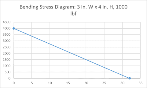
3. Update Charts Automatically with Dynamic Titles, Axes, and Labels
To make it easy to update chart titles, axis titles, and labels you can link them directly to cells. If you need to make a lot of charts, this can be a real time-saver and could also potentially help you avoid an error when you forget to update a chart title.
To update a chart title, axis, or label, first create the text that you want to include in a single cell on the worksheet. You can use the CONCATENATE function to assemble text strings and numeric cell values into complex titles.
Next, select the component on the chart. Then go to the formula bar and type “=” and select the cell containing the text you want to use.
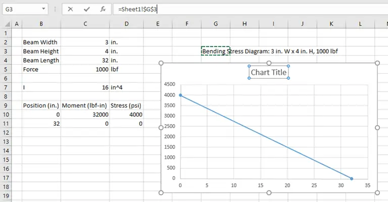
Now, the chart component will automatically when the cell value changes. You can get creative here and pull all kinds of information into the chart, without having to worry about painstaking chart updates later. It’s all done automatically!
4. Hit the Target with Goal Seek
Usually, we set up spreadsheets to calculate a result from a series of input values. But what if you’ve done this in a spreadsheet and want to know what input value will achieve a desired result?
You could rearrange the equations and make the old result the new input and the old input the new result. You could also just guess at the input until you achieve the target result.
Fortunately though, neither of those are necessary, because Excel has a tool called Goal Seek to do the work for you.
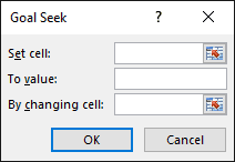
First, open the Goal Seek tool: Data>Forecast>What-If Analysis>Goal Seek.
In the Input for “Set Cell:”, select the result cell for which you know the target. In “To Value:”, enter the target value.
Finally, in “By changing cell:” select the single input you would like to modify to change the result. Select OK, and Excel iterates to find the correct input to achieve the target.
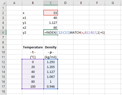
5. Reference Data Tables in Calculations
One of the things that makes Excel a great engineering tool is that it is capable of handling both equations and tables of data. And you can combine these two functionalities to create powerful engineering models by looking up data from tables and pulling it into calculations.
You’re probably already familiar with the lookup functions VLOOKUP and HLOOKUP. In many instances, they can do everything you need.
However, if you need more flexibility and greater control over your lookups use INDEX and MATCH instead. These two functions allow you to lookup data in any column or row of a table (not just the first one), and you can control whether the value returned is the next largest or smallest.
You can also use INDEX and MATCH to perform linear interpolation on a set of data. This is done by taking advantage of the flexibility of this lookup method to find the x- and y-values immediately before and after the target x-value.
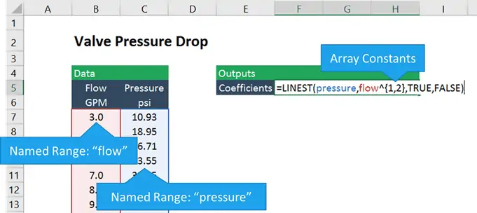
6. Accurately Fit Equations to Data
Another way to use existing data in a calculation is to fit an equation to that data and use the equation to determine the y-value for a given value of x.
Many people know how to extract an equation from data by plotting it on a scatter chart and adding a trendline. That’s OK for getting a quick and dirty equation, or understand what kind of function best fits the data.
However, if you want to use that equation in your spreadsheet, you’ll need to enter it manually. This can result in errors from typos or forgetting to update the equation when the data is changed.
A better way to get the equation is to use the LINEST function. It’s an array function that returns the coefficients (m and b) that define the best fit line through a data set. Its syntax is:
LINEST(known_y’s, [known_x’s], [const], [stats])
Where:
known_y’s is the array of y-values in your data,
known_x’s is the array of x-values,
const is a logical value that tells Excel whether to force the y-intercept to be equal to zero, and
stats specifies whether to return regression statistics, such as R-squared, etc.
LINEST can be expanded beyond linear data sets to perform nonlinear regression on data that fits polynomial, exponential, logarithmic and power functions. It can even be used for multiple linear regression as well.
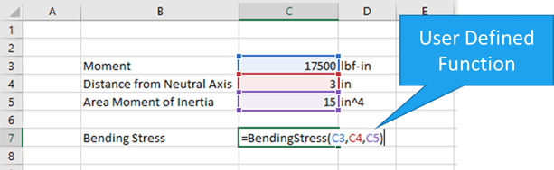
7. Save Time with User-Defined Functions
Excel has many built-in functions at your disposal by default. But, if you are like me, there are many calculations you end up doing repeatedly that don’t have a specific function in Excel.
These are perfect situations to create a User Defined Function (UDF) in Excel using Visual Basic for Applications, or VBA, the built-in programming language for Office products.
Don’t be intimidated when you read “programming”, though. I’m NOT a programmer by trade, but I use VBA all the time to expand Excel’s capabilities and save myself time.
If you want to learn to create User Defined Functions and unlock the enormous potential of Excel with VBA, click here to read about how I created a UDF from scratch to calculate bending stress.
8. Perform Calculus Operations
When you think of Excel, you may not think “calculus”“. But if you have tables of data you can use numerical analysis methods to calculate the derivative or integral of that data.
These same basic methods are used by more complex engineering software to perform these operations, and they are easy to duplicate in Excel.
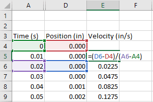
To calculate derivatives, you can use the either forward, backward, or central differences. Each of these methods uses data from the table to calculate dy/dx, the only differences are which data points are used for the calculation.
- For forward differences, use the data at point n and n+1
- For backward differences, use the data at points n and n-1
- For central differences, use n-1 and n+1, as shown below
If you need to integrate data in a spreadsheet, the trapezoidal rule works well. This method calculates the area under the curve between xn and xn+1. If yn and yn+1 are different values, the area forms a trapezoid, hence the name.
9. Troubleshoot Bad Spreadsheets with Excel’s Auditing Tools
Every engineer has inherited a “broken” spreadsheet. If it’s from a co-worker, you can always ask them to fix it and send it back. But what if the spreadsheet comes from your boss, or worse yet, someone who is no longer with the company?
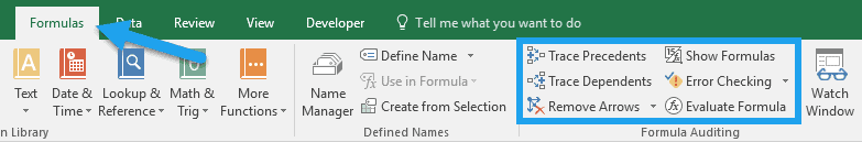
Sometimes, this can be a real nightmare, but Excel offers some tools that can help you straighten a misbehaving spreadsheet. Each of these tools can be found in the Formulas tab of the ribbon, in the Formula Auditing section:
As you can see, there are a few different tools here. I’ll cover two of them.
First, you can use Trace Dependents to locate the inputs to the selected cell. This can help you track down where all the input values are coming from, if it’s not obvious.
Many times, this can lead you to the source of the error all by itself. Once you are done, click remove arrows to clean the arrows from your spreadsheet.
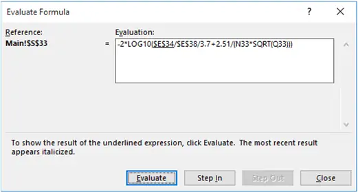
You can also use the Evaluate Formula tool to calculate the result of a cell – one step at a time. This is useful for all formulas, but especially for those that contain logic functions or many nested functions:
10. BONUS TIP: Use Data Validation to Prevent Spreadsheet Errors
Here’s a bonus tip that ties in with the last one. (Anyone who gets ahold of your spreadsheet in the future will appreciate it!) If you’re building an engineering model in Excel and you notice that there is an opportunity for the spreadsheet to generate an error due to an improper input, you can limit the inputs to a cell by using Data Validation.
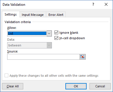
Allowable inputs are:
- Whole numbers greater or less than a number or between two numbers
- Decimals greater or less than a number or between two numbers
- Values in a list
- Dates
- Times
- Text of a Specific Length
- An Input that Meets a Custom Formula
Data Validation can be found under Data>Data Tools in the ribbon.
Wrap Up
That’s it! I hope you learned a few advanced Excel techniques that will make your life as an engineer a little easier and give you more confidence in Excel.
If you want to learn more about unlocking the potential of Excel for engineering, Learn how to advance in Excel with engineering-focused training that equips you with the skills to streamline projects and accelerate your career. Click here to get started.